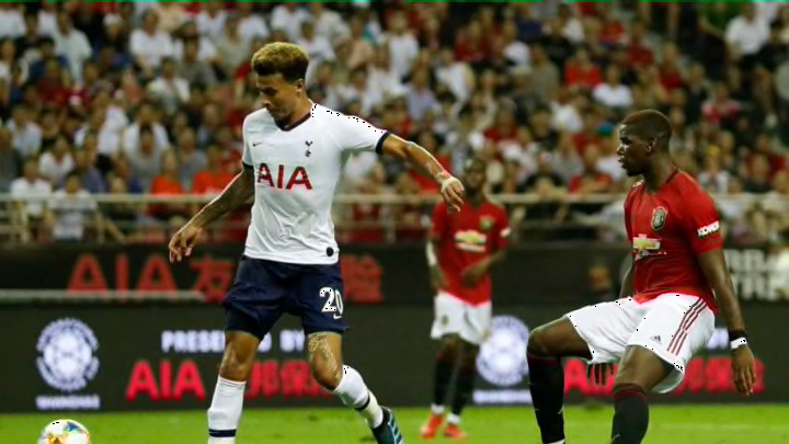
A new season means all-new Premier League kits for football fans to feast their eyes (and wallets) on. Each campaign has its fair share of duds and delights, and here is our ranking for the fare on offer for the 2019/20 season.
Now that the new season is just around the corner, it’s time to take a look at the best (and worst) of the new kits the Premier League has to offer:
20. Southampton
https://twitter.com/SouthamptonFC/status/1153561382404726785
Where to begin with this disaster of a kit? The betting logo stands out like a sore thumb, clashing horribly with the red and white stripes. The decision to colour the shoulders and top of the chest black also backfires, leaving the shirt looking oddly sectioned off. Comfortably the worst home kit of the season.
19. Norwich City
https://twitter.com/maxaarons2/status/1155175013030473728
A kit that seems to have drawn inspiration from the “printer-that’s-run-out-of-ink” fare served up by Spurs and Man United last season. Unfortunately, those shirts were not a great starting point for a design, and this one goes a step further, incorporating a fade effect on the shoulders too.
18. Crystal Palace
The perfect start.#CPFC pic.twitter.com/Z5qAmegvxz
— Crystal Palace F.C. (@CPFC) July 16, 2019
This is one of those kits that just does not sit well with me, not because of any major problems, but largely due to an accumulation of smaller ones. The thin white lines on the blue stripes do not add anything to the kit, and the sponsor logo is extremely distracting. The sudden end of the stripe on the sleeve also contributes to a generally lacklustre kit.
17. Newcastle

I do not mind the thicker stripes, and I quite like the black-and-white club crest. But the stacking of the crest, Puma logo and sponsor in the middle of the shirt makes it look cluttered and messy. It is also another example of a sponsor greatly detracting from an otherwise alright kit. Would, however, be ranked last if they had the horrendous sponsor logo from their preseason tournament in China (pictured) during the whole season.
16. Wolves

You can see what they were going for with their follow up to last year’s excellent kit, but in my opinion Wolves miss the mark. The colour of the kit is a little more garish, while the kit is a little more plain. The sponsor logo is also unattractive (a running theme), and it is a poor effort as they venture into European competition.
