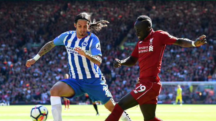
English Premier League: All home kits ranked by The Top Flight
By Zaph Hutson

https://twitter.com/Football__Tweet/status/994142424015495169
Like their Mancunian neighbors, City have regressed in their style. Last year was great. Their kit was almost totally baby blue and the club crest was a brilliant accent. However, now they’ve gone with an odd metallic blue. Maybe they’re going all in on the ‘Shark Team‘ thing.
Also, those stripes along the shoulders just don’t look right. They add a distressed and cheap feel.